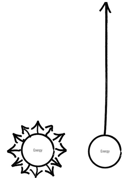
From when I first saw it and each time it pops up after that, I admired the brilliance of the above infographic. It explains the concept in such a clear concise way.
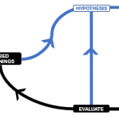
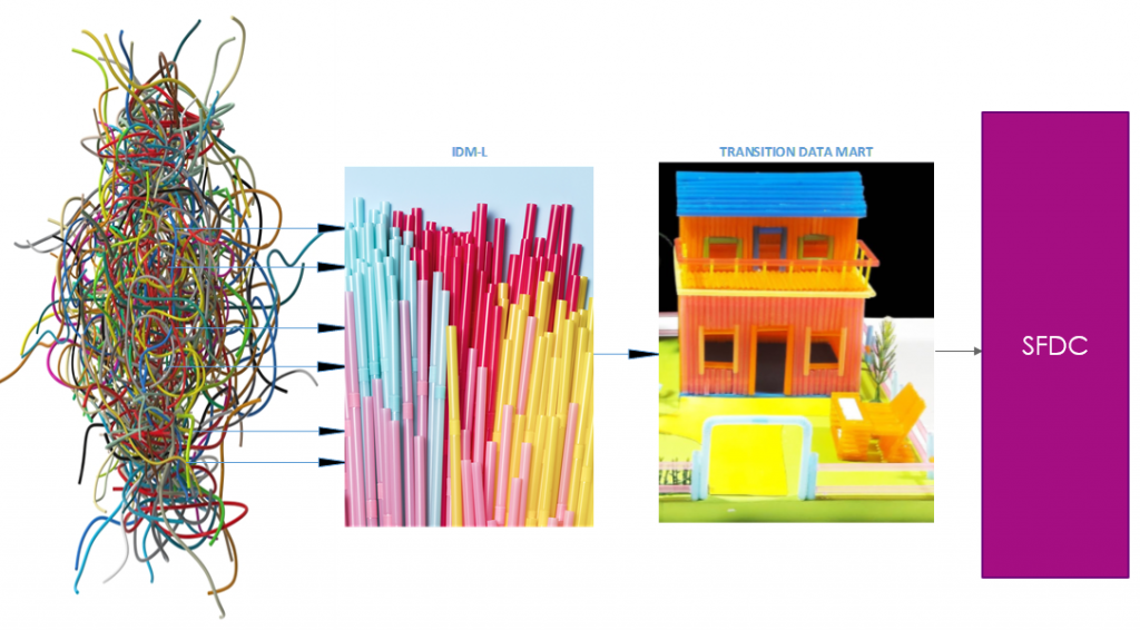
A couple years back, when I put forward the below image to depict the components of our data processing, it felt risky (as it could either be perceived as childish, or worse, undermining). But — it turns out to be an effective way to clarify the components and help build stakeholders alignment.
Which brings me to…
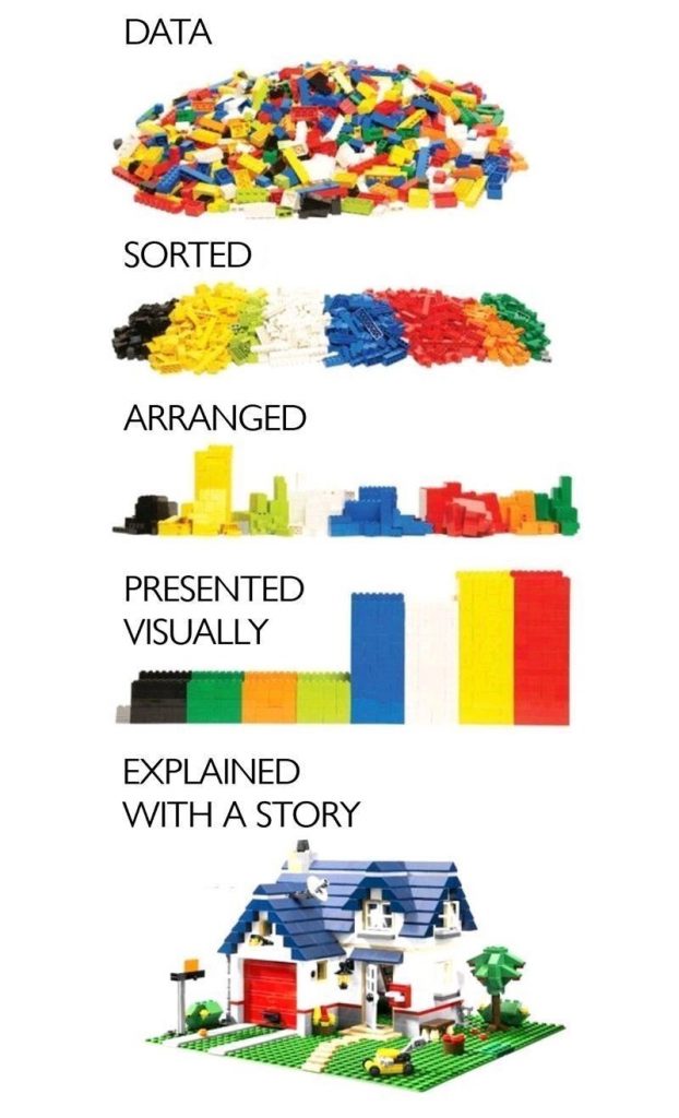
There is an article brewing in my head for the past few weeks; but it also feels too risky to put forward. When I bring it up verbally though; it sparks a meaningful conversation. The uncertainty of sharing it in a public forum, via an asynchronous modal, is rather strong and it’s holding me back — as it can be easily misread &/ misinterpreted or even misguided into a different rabbit holes, and could cause unintended hurt. Until I saw the above image again today. It posed an opportunity for me to discuss “EXPLAINED WITH A STORY”.
From a recent experience of building in data asset within a digital transformation program, one of the key lesson I got is the importance of using the right data as a compass. Our program’s actual success metrics (number of customers served, number of onboarded services, the cost to provide a specific service per customer, increased customer satisfaction from being in the digital platform) are either have little to no movements or difficult to measure. The difficulty in measuring has to do with the need for broader business influencing and involvement (external to the program). Based on our experience, while it is tempting to measure something that moves a lot (offers that sense of progress); publishing the wrong measure creates noise and cause misalignment all around for organisation. Instead of measuring those success metrics, we measure and reward performance based on team velocity and utilisation. As one can imagine, it drives a very different behaviour.
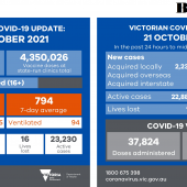
Moving to a more generally applicable example; let’s have a look at these daily publication from Department of Health in Victoria, Australia.
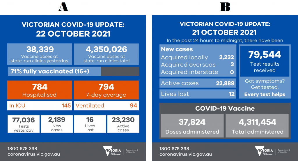
When it was announced that Victoria is opening up (from COVID lockdown restrictions), there were much doubts and questions around the plan (amidst the relief). How is that that “we went into the 5th lockdown based on an outbreak of 18 COVID cases; and opening up at over 20,000 active cases in the community”? From data perspective, based on the “B” view reported, the question is a very logical one. “B” presents the right story for the previous strategy where we are aiming for COVID zero as a collective.
In contrast, the “A” view focuses the conversation in alignment with the change in strategy; i.e. increasing the percentage of fully vaccinated, to ensure that our hospitals will not be overwhelmed by COVID patients and minimise the number of lives lost.
The goal hasn’t changed, but it’s a big long term one, minimising the number of lives lost. The right story is necessary, to get us there. Continuing to publish number of new and active cases when the strategy is no longer to reduce number of COVID cases creates doubts, and noise for collective which slows down our pace to get to the collective goal.
Before I was made aware of the “A” view, I considered taking a stab at it; and gained awareness of how fraught with discomfort it is as we are talking about people’s lives; someone’s loved ones. Then, there is the question around trend (represented here by 7-day average) as well; and utilisation of the hospital, ICU, and ventilators (represented here by numbers, missing capacity view).
“EXPLAINED WITH A STORY” involved making an assertion. It requires skin in the game.
An assertion begins with your take on the world, but it also requires action. It has to be open to debate. An informed team member should be able to disagree with you, and your engagement with them can make your assertion even more insightful and powerful.
But it’s not easy.
If you make an assertion, you might be wrong.
And if you make an assertion, someone might ask you to dig deeper, or to run with it and lead.
And if you take action, you might not succeed.
And failure is no fun.But assertions are the real work.
Seth Godin (link)
“PRESENTED VISUALLY” does offer flexibility, allows data consumers to move things around and build the story.
But — may I assert that: data offers most value, as a compass for organisation. And that, requires commitment for it to be “EXPLAINED WITH A STORY”, making it digestible for everyone in the organisation.
Just like the above image, it’s a beautiful double storey family home, with a beautiful tree and garage. There’s a story to be taken on board, and discussed / debated upon.
Does your organisation ensure that data is explained with a story? If not, why?